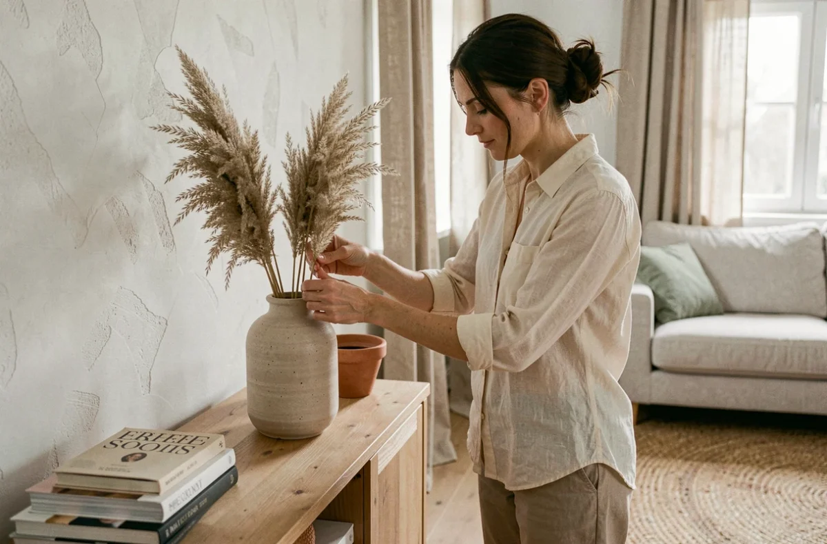
Home decoration is not just about choosing a wall color or moving a sofa. Transforming an interior requires mastering technical considerations that are often overlooked: air quality, material consistency, and management of natural and artificial light. Here, we discuss concrete levers that produce lasting change, beyond fleeting trends.
Emission labels and flooring choices: a home decoration criterion too often neglected
Every paint, adhesive, or flooring sold in France has an indoor air emission label rated from A+ to C since 2013. This rating measures the volatile organic compounds released after application. Choosing a product rated A+ is not a health luxury; it is a project parameter just like color or finish.
We recommend checking this label before purchasing wall paint, furniture varnish, or flexible flooring. A product rated B or C in a poorly ventilated space (bedroom, closed office) degrades air quality for several weeks after installation.
The same reasoning applies to upholstery textiles. Stain-resistant and water-repellent treatments sometimes use PFAS, persistent substances whose environmental and health impacts are receiving increasing attention. Favoring untreated textiles or those certified by a reliable label turns a decorative choice into a health consideration. We have observed that the ranges of cushions, curtains, and covers without chemical treatment have significantly expanded in recent years, making this criterion easy to integrate into a decoration project.
To delve deeper into these topics and find concrete ideas, the decoration section of Monsieur Bricoleur details numerous techniques suited to each room.
Light and color temperature: controlling the ambiance of a room
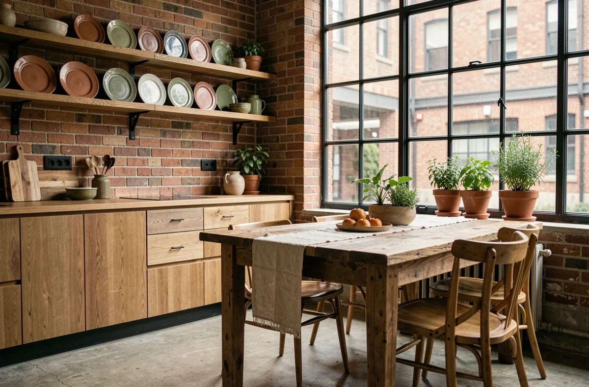
Light changes the perception of a space more radically than changing furniture. Increasing the number of light sources remains common advice, but it often lacks the technical data that makes a difference: color temperature, expressed in kelvins.
Warm lighting (around 2,700 K) is suitable for the living room and bedroom. It enhances earthy tones and natural materials like wood or linen. Neutral lighting (3,500 to 4,000 K) is better suited for the kitchen or a work surface, where visual precision takes precedence over atmosphere.
Combining multiple sources at different temperatures in the same room creates distinct functional zones without partitioning the space. A floor lamp at 2,700 K near the sofa and a ceiling light at 4,000 K above the central island are enough to redefine a living room open to the kitchen.
- Dimmable bulbs allow for transitioning from a work ambiance to a subdued atmosphere without changing fixtures.
- LED strips recessed under furniture or along a shelf provide indirect lighting that visually enlarges the space.
- Directed lighting (adjustable spotlights) highlights an object, painting, or wall niche better than a diffuse ceiling light.
Reuse of furniture: structuring a sustainable transformation project
Finding an antique piece of furniture to integrate into a contemporary interior is nothing new. What has changed is the structuring of reuse around professional channels and the social and solidarity economy. Reuse projects now document the origin, condition, and usage conditions of recovered items, which secures the purchase and facilitates integration into a coherent layout.
We find that this approach goes beyond mere ecological gestures. A solid oak sideboard from the 1960s, sanded and oiled, offers a material density that no particle board furniture can replicate. Reuse becomes a lever for upgrading within a controlled budget.
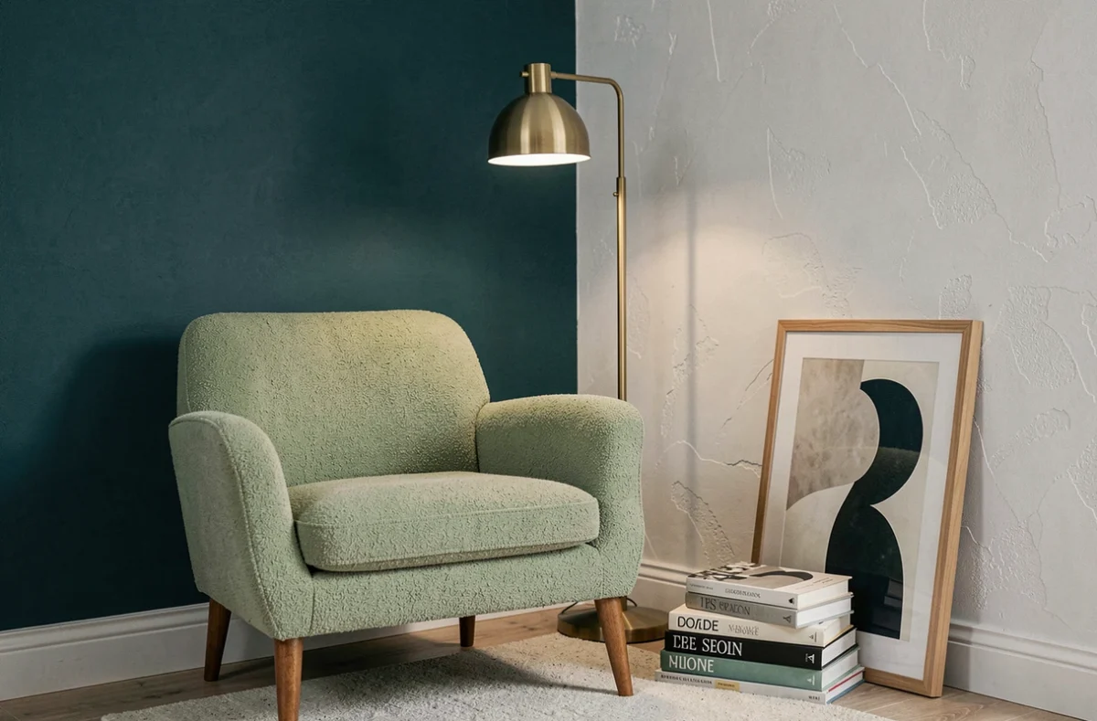
The point of caution concerns technical compatibility. An antique piece of furniture may require updating to current standards (hardware, structural stability) before being integrated into a daily living space. Budgeting for this aspect avoids unpleasant surprises.
Consistency of materials and decorative style: avoiding the catalog effect
The most common mistake in a home decoration project is accumulating trendy elements without a guiding thread. A maximum of three dominant materials per room ensures visual clarity. Beyond that, the eye no longer knows where to rest.
We recommend choosing a primary material (light wood, polished concrete, natural stone), a secondary material (metal, glass, rattan), and a unifying textile (linen, velvet, thick cotton). This simple framework adapts to all styles, from minimalist Scandinavian to more elaborate contemporary.
- In a living room, a velvet sofa combined with a wooden coffee table and black metal lighting creates a coherent trio.
- For a bedroom, linen (bedding, curtains) combined with the wood of the bed frame and a brass-framed mirror is enough to set an atmosphere.
- In the kitchen, the wood of the countertop, the tiling of the backsplash, and the stainless steel of the appliances form a functional and harmonious ensemble.
Green plants play a binding role between these materials. They provide an organic texture that softens the rigidity of metal or the coldness of concrete. Their presence in a corner of the room or on an open shelf completes a layout without weighing down the composition.
Ultimately, transforming an interior relies as much on technical choices as on aesthetic ones. Checking the emission label of a paint, calibrating the color temperature of lighting, or limiting materials to three per room yields more lasting results than a simple cushion change. It is these considerations, often invisible in magazine photos, that make the difference in daily life.